With branding being a constantly evolving commodity, and what is considered ‘chic’ always shifting, it’s imperative that businesses keep abreast of what the next big thing is in terms of brand trends.
Learning to interpret or predict upcoming trends is an invaluable skill to have. Being able to spot upcoming popular aesthetics not only keeps your branding looking relevant and contemporary in comparison to your competition, but it also stops you from slipping into the pitfalls of stale and tired brand identity.
Harnessing this can help you make the most of these trends, and transform these aesthetic styles into profit.
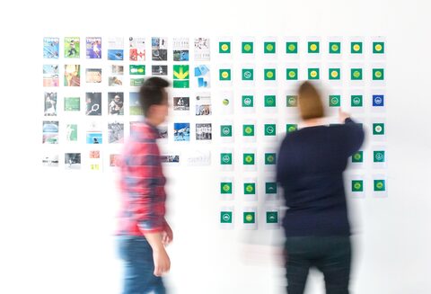
Because of the rise of short attention span web content, most companies are opting for sharp, concise content to capture their customers’ attention, instead of overdone, tangled graphics. Which can be achieved easily with minimalistic shapes.
This design principle allows you to take essential visual elements and amplify them through a bold and striking colour palette, to really drive the eye toward the content you want your audience to see. They are simplistic, instantly recognisable, quick to generate, and effortlessly stylish – making them incredibly memorable and easy to visually digest.
Due to most content now being designed for and read through digital screens, this trend provides you with an ideal way to give your brand a cohesive feel across your digital touchpoints.

After the last year, there’s been a huge push to get people back out on public transport, so you can be sure to see many new, revamped liveries rolling around.
Updating your bus and coach fleet is the perfect opportunity to showcase your branding in a kinetic, eye catching way. It works as a personalised mobile billboard that gets your message out to as many people as possible, without the hassle of having to go door to door.
Instead of settling for outdated graphics, many companies have begun waking up to the fact that it’s also super simple and affordable to regularly update their liveries, so this trend will only grow from here. Find out more about how we can help you revamp your bus and coach livery here.
Watch our fleet experts describe the challenges of bus & coach branding.
The various trends that are starting to become more and more noticeable this year, aren’t just in terms of logo design, but are also general trends of social issues lots of other companies are focusing their support on.
Authenticity is paramount in the modern age because everyone is more connected than ever before. Consumers now seek out brands that align with their moral compass and issues that are important to them. And, with so many brands to see and choose from, people want to feel connected to the face behind the company instead of being sold to by a corporation void of personality.
To this end, having a clear message of what you stand for and who you are only serves to strengthen your brand voice.
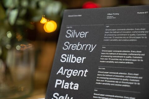
There's something about classic fonts that just keep companies coming back for more. This year has seen a rise in a lot of retro sans serifs making a comeback, as more companies look to implement an elegant and sharper design with clean lines that really make their branding pop.
From companies like Spotify to Dolce & Gabbana, it seems that a lot of big brands recognise the value in having recognisable typography, with slim and bold elements that provide a bit of movement - without looking tacky or dated. Distinct sans serif fonts are a perfect way to do this.
Keep an eye out for fonts like Qualy, Futura, and Monaco - to name a few - as the year goes on and more brands opt for a slicker, futuristic style with a vintage twist.

In the last few years we’ve seen a big decrease in the trend of 3D graphics, and a sweeping return to flat iconography and illustrations. These aesthetics not only evoke a sense of nostalgia, but are also infinitely easier and quicker to replicate across various touchpoints. It’s become a fashionable way of retaining a captive audience, drawn in by the playful 2D style that provides a crisper, cleaner user experience.
This style of design is centred more around the content and colour, instead of shading or depth, which allows for wider accessibility on multiple digital devices. With the rise in digital connectivity, it’s now also a lot easier to find web designers and artists who can easily produce this form of artwork, meaning you can have detailed branding designed in less time - with the same level of quality.
With loads of new trends to keep up with, it can feel a bit overwhelming knowing where to turn or which trend to follow. So let us do that for you!
We have our finger on the pulse of the branding & design industry and know how to predict the next big thing. We have a vast in-house team of experts that can help you with brand design, strategic and competitor analysis, livery and spaces graphics, content creation, and so much more.
Get in touch with us today, and let us help you bring your brand to life!